At the end of last year, I shared a sneak peek of NeuralWorks' rebranding, a project I've developed in-house. This project has been both a challenge and an opportunity to bring design insight to a company that, after nearly four years, is still evolving and growing.
I've always been fascinated by how brands build their visual identity, even in seemingly "improvised" ways. NeuralWorks' first logo was born in a Google Slides presentation. That initial design not only accompanied NeuralWorks through its growth phase but also became the foundation upon which we're now building a new image, a project I'm personally leading.
A Short Take on Visual Identity and Branding
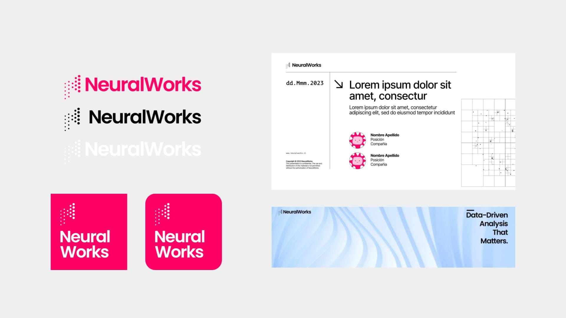
Visual identity is essential to branding —it visually conveys a brand's personality, values, and purpose. While branding encompasses the overall strategy, including tone of voice, mission, and messaging, visual identity focuses on the tangible elements that make a brand recognizable. Think of it as the “look and feel” of a brand: the logo, color palette, typography, and imagery that come together to tell a cohesive story. These elements are not just decorative; they help create an emotional connection with the audience and ensure consistency across all touchpoints, from websites to events. A strong visual identity doesn’t just support a brand—it elevates it, making it memorable and distinct in competitive markets, such as the tech industry.
At its core, a visual identity requires a few essential elements to be effective. The logo is the cornerstone, serving as the most recognizable symbol of the brand. A well-chosen color palette sets the tone and evokes specific feelings, while typography reinforces the brand’s personality through font choices. Imagery—whether photography, illustrations, or icons—adds depth and context to the brand’s narrative. Together, these components form the foundation of a visual identity system that ensures consistency across all platforms and materials. When used strategically, these elements not only enhance brand recognition but also build trust and loyalty over time.
To Brand or Not Brand
As highlighted in Org Design for Design Orgs: Building and Managing In-House Teams (2016), successful organizations balance Business, Technology, and Design to create a cohesive identity that resonates across all levels. This framework shows how design is not just about aesthetics; it’s about aligning design decisions with business goals and leveraging technology to bring them to life.
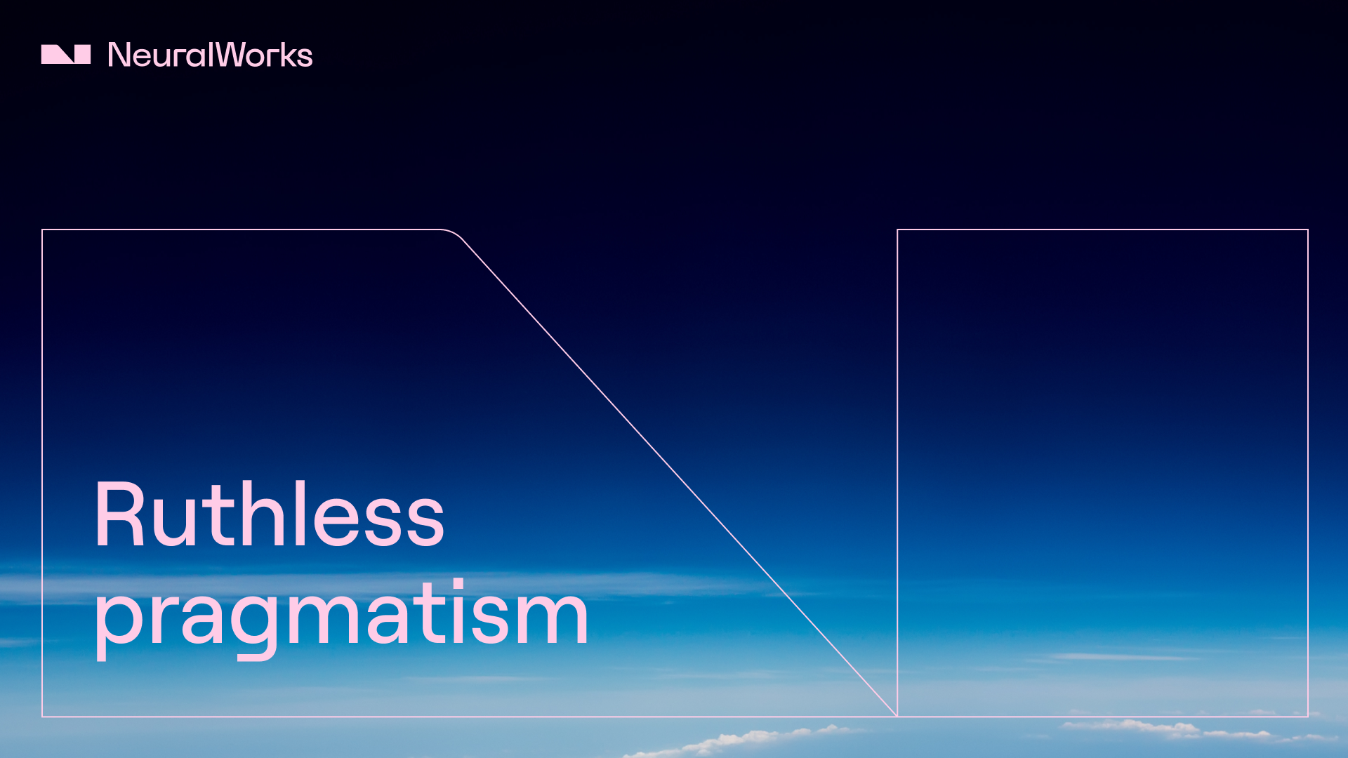
A strong brand helps businesses stand out, communicate their values, and build trust with their audience. We all have brands that inspire us and others that simply don't resonate. The same applies to companies. From the outset, we envisioned a minimalist design focused on highlighting technical aspects without superfluous embellishments. For some, less is more; for others, less is bore. Putting personal preferences aside—though I was lucky to integrate some into my work—I’ve learned that crafting a brand with clean yet engaging lines is both an art and a challenge.
I approached this rebranding with the understanding that design is not just an outcome but an ongoing process of iteration and refinement.The new visual identity of NeuralWorks represents not a final destination but a strategic journey that will continue to evolve as the company grows. This process-oriented mindset allows us to adapt the visual identity in response to changing market conditions, technological advances, and organizational development, ensuring the brand remains relevant and impactful over time.
Designed to Scale
When I applied to NeuralWorks, I recognized that becoming the team's first designer would present an exciting challenge. What attracted me was a proposal that diverged from typical "Tech" industry conventions—those predictable brands with blue tones and floating bar graphics—and a clear intention to forge a different path. Observing the team's work closely, I discovered numerous valuable elements that weren't adequately reflected in digital channels or on the website, and I was determined to bring them to life.
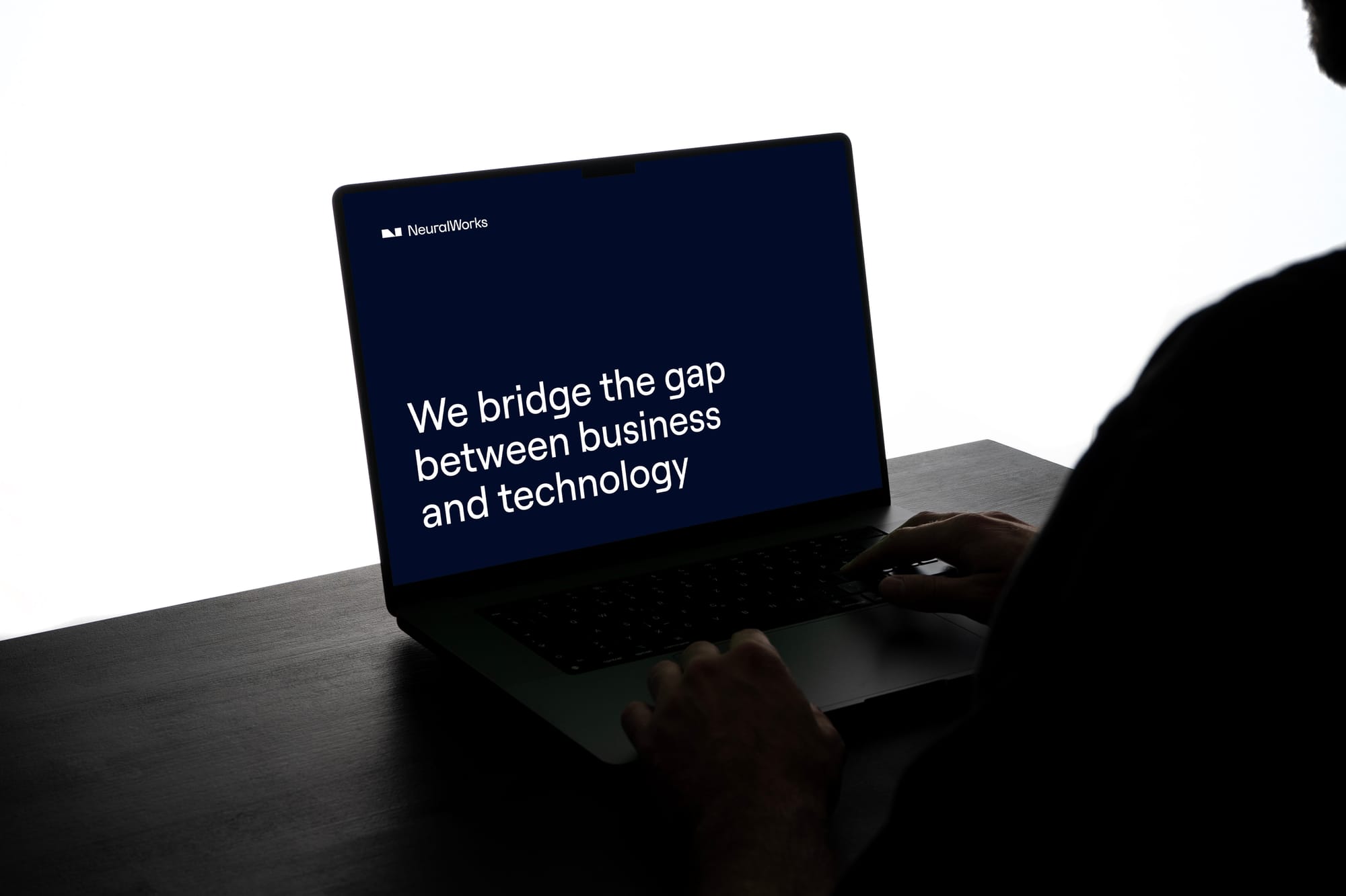
The objective at NeuralWorks wasn't merely to introduce a professional design vision and unify the brand's visual identity. This rebranding needed to capture the growth and maturity the company has achieved while preserving its startup mindset: dynamic, bold, and energized to continue tackling complex problems.
Shaping a Distinctive Visual Style
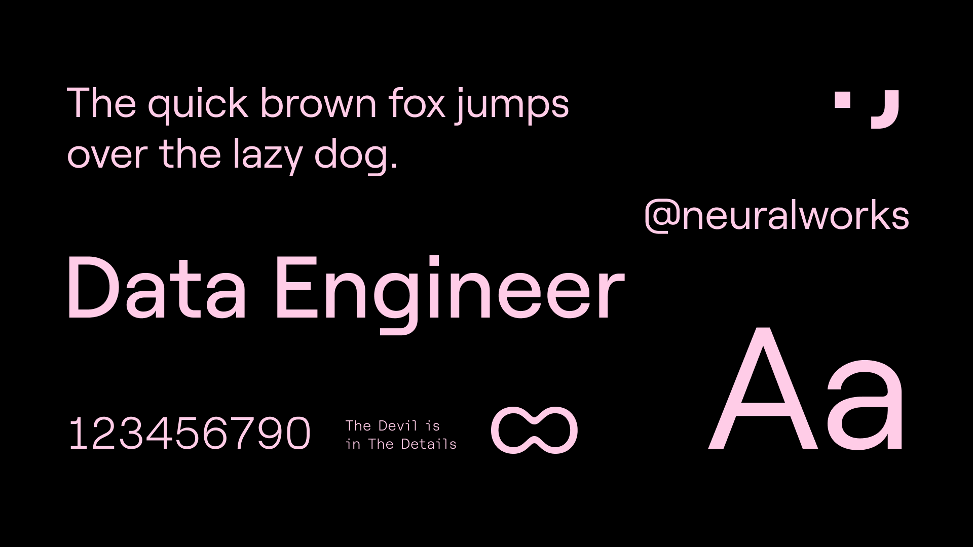
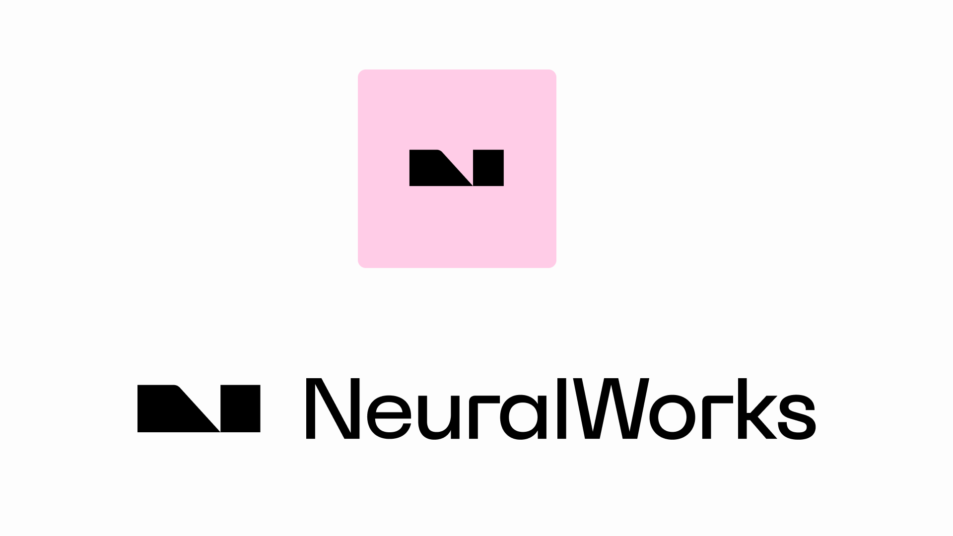
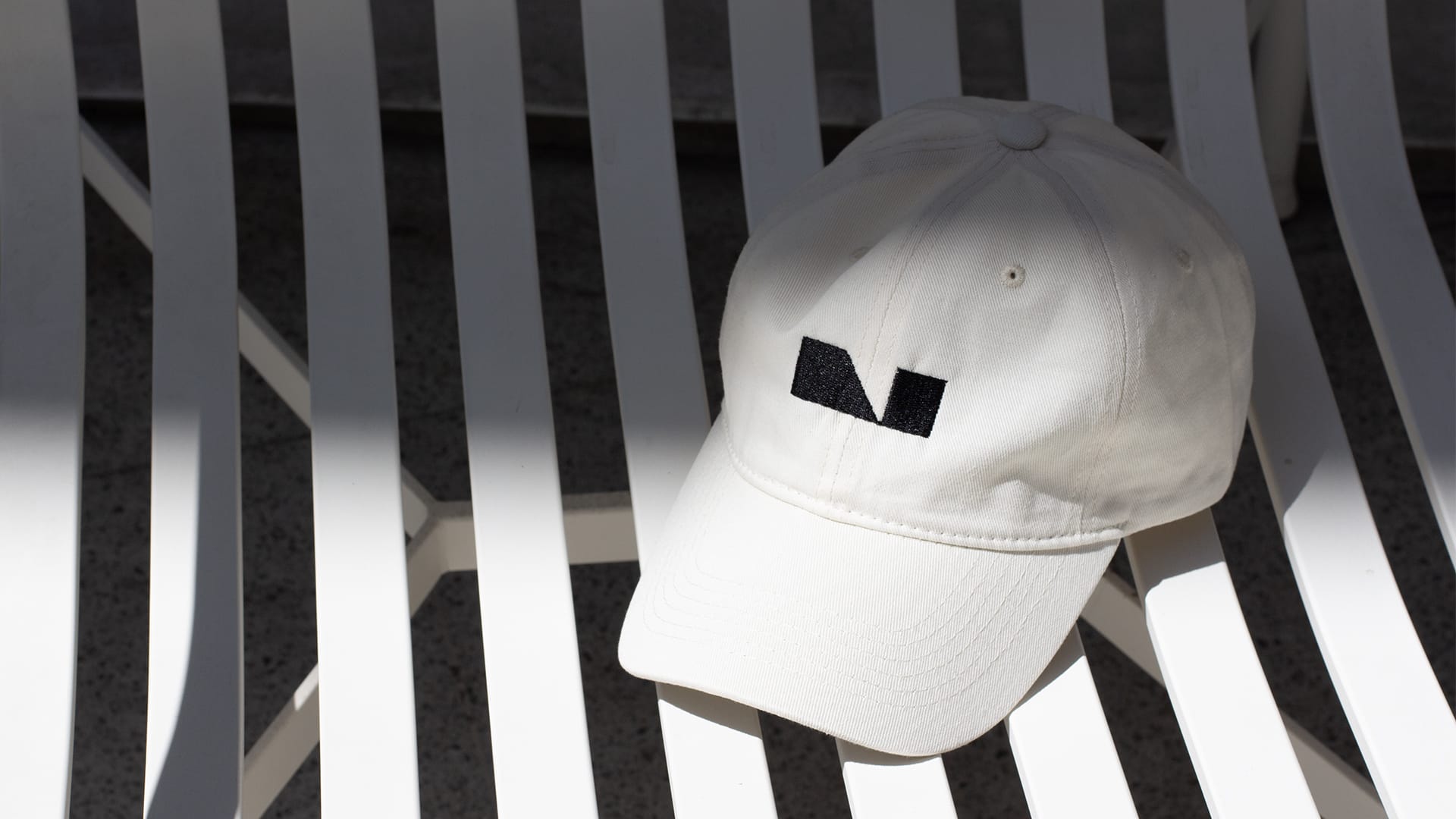
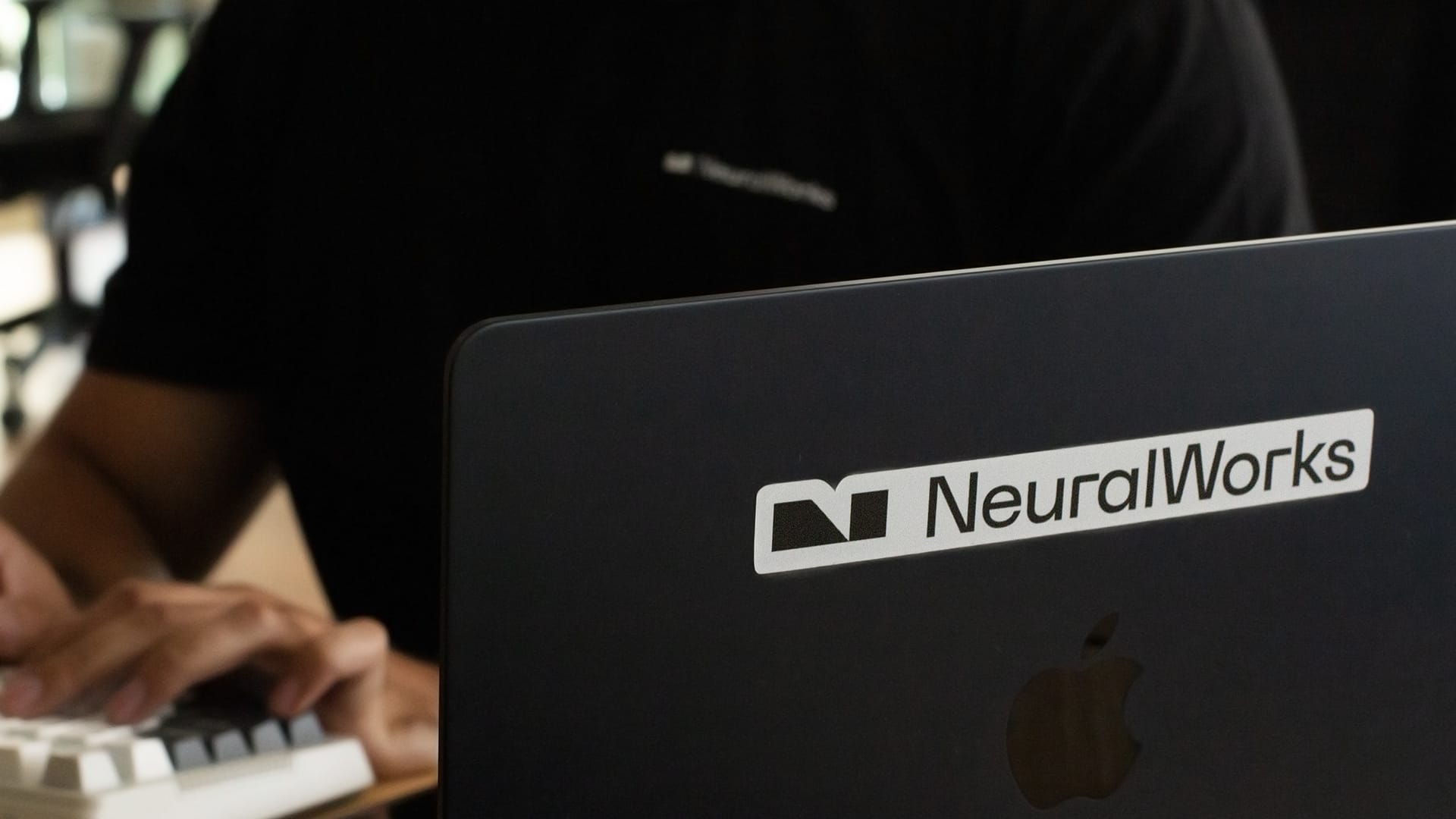
I reimagined the 'N' in the symbol, moving away from its initial inspiration rooted in scatter plot graphics, which posed significant legibility challenges. Instead, I designed two polygons converging at a single vertex, creating a sense of tension and balance. The objective wasn’t to reinvent the wheel but to explore how to craft an 'N' that feels unique and unconventional while breaking away from traditional approaches.
Additionally, this symbol possesses an additional graphic dimension: depending on the framing, it allows a subtle "N" to emerge, adding depth and dynamism to the design.
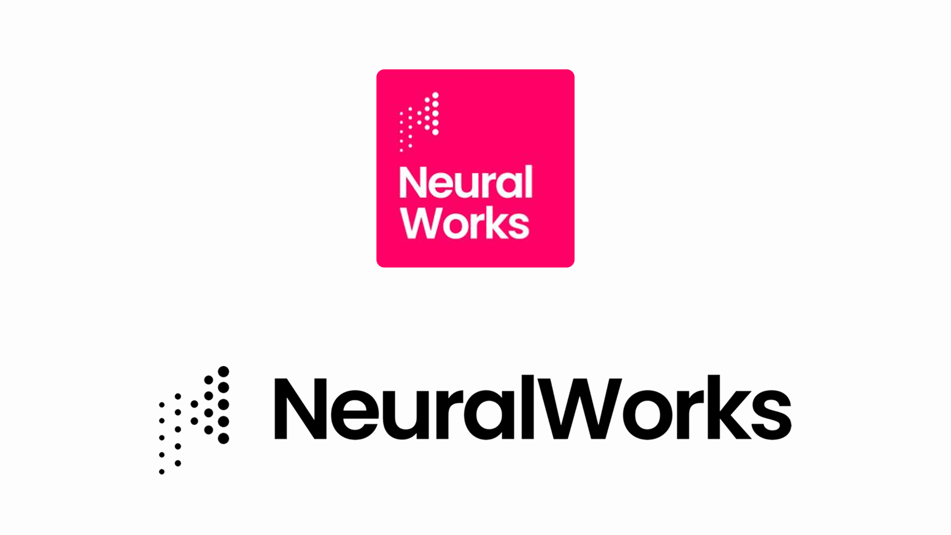
Left: Old logo with outdated brand color. | Right: New logo showcasing the current branding.
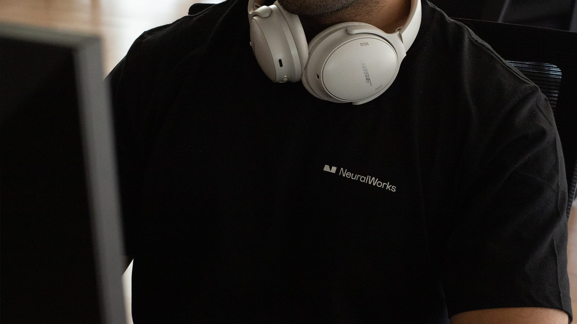
The brand color evolved from a fluorescent magenta to a light pink, maintaining that youthful and distinctive character while transforming it into a more balanced and harmonious tone. This transition aims to preserve the brand's freshness while refining its visual presence for greater versatility and impact across various applications and contexts. I take pleasure in seeing how this new visual identity will accompany the next chapters in NeuralWorks' story.
One Step at a Time
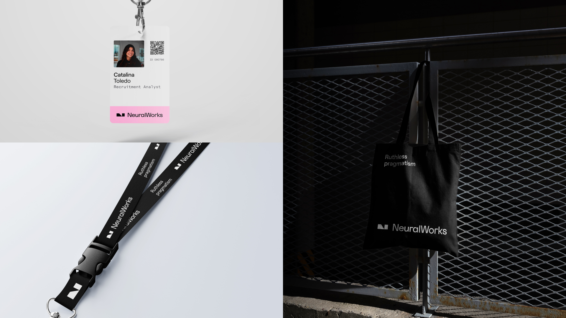
I'm still fine-tuning details to ensure the new visual identity is fully deployed during the first half of this year. This rebranding project represents not an endpoint but the beginning of an enhanced visual language that will continue to be strengthened and expanded over time. I'm committed to building a robust design system that can grow with the company while maintaining consistency across all touchpoints(website, social media, meetups, events). I'll keep you updated as we continue to refine and enhance this identity system through ongoing iteration and improvement.
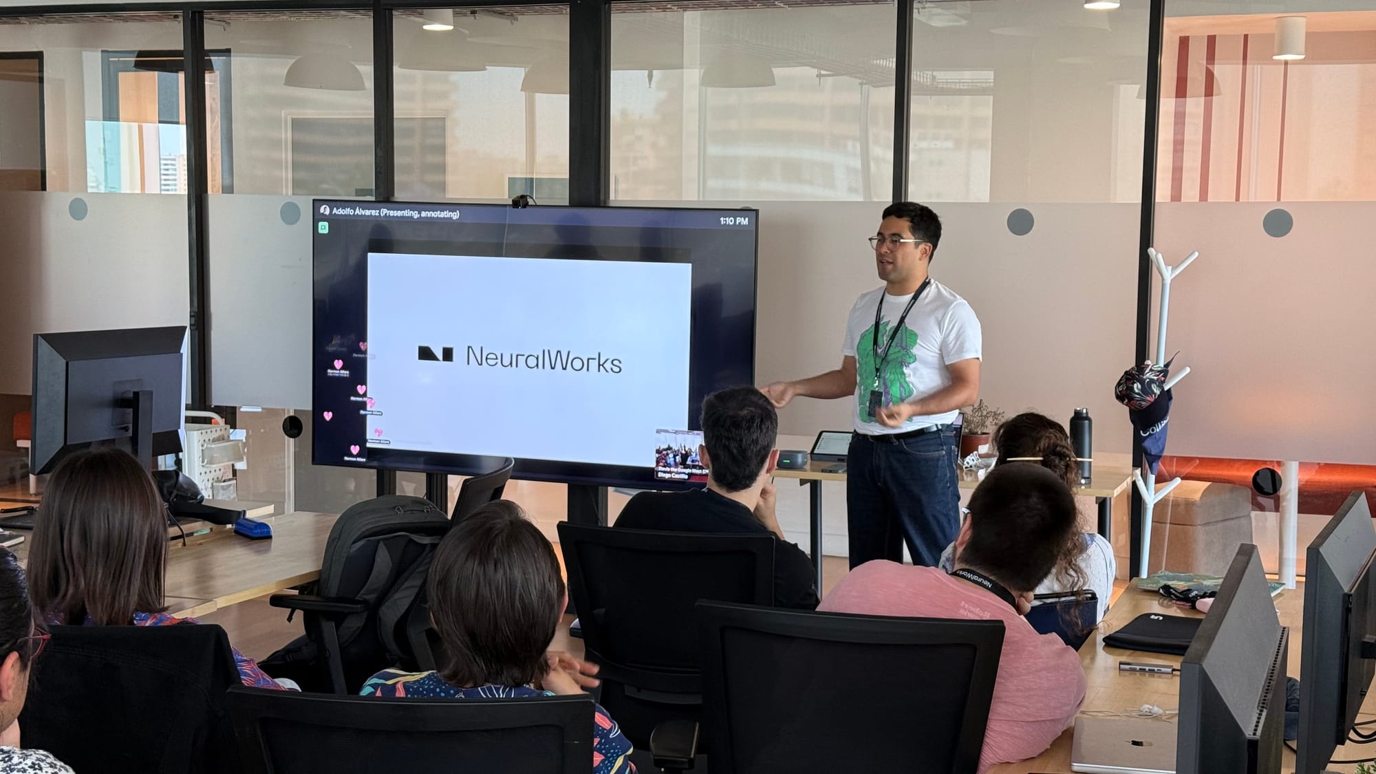
This project wouldn't be possible without the valuable input and support from Adolfo, Lore, Santi, Rayén, Diego, Sofi, Gus, and Nacho.
Afterthoughts
NeuralWorks' brand is starting to make waves beyond the digital realm—reaching the ends of the Earth, literally. Thanks to Sofi’s adventurous spirit, our new logo made it to Antarctica, standing out against the white landscape —a story only she can truly tell. It's proof that the brand we are building can resonate in the most challenging and uncharted places.